The question I get most from people who encounter this work for the first time isn’t about the subject or the composition. It’s about the sky. Why is it so dark? Why does the grass look like it’s lit from inside? Why does everything feel like it’s from a different spectrum?
It is.
What infrared light actually is
Visible light occupies a narrow band of the electromagnetic spectrum: roughly 400 to 700 nanometers, from violet to red. Infrared starts just beyond where our eyes stop. We can’t see it, but it’s everywhere. Plants are full of it. Skin reflects it. Skies absorb it. Water scatters it differently depending on depth and movement.
A standard camera is designed to reject infrared, the same way your eye does. The sensor or film is tuned to the visible range. To photograph infrared, you have to either use film specifically formulated to respond to that wavelength, or remove the infrared-blocking filter from a digital sensor and replace it with one that passes only infrared light.
Both approaches record the world in a way no amount of post-processing can replicate. The tones aren’t altered after the fact. They’re what the light actually is at the moment of capture.
What it does to what you’re photographing
The reason foliage glows is straightforward once you know it: chlorophyll in plant cells reflects infrared light intensely. A green meadow that looks ordinary to the eye becomes something close to luminous on an infrared-sensitive medium. The brighter the living vegetation, the more infrared it throws back.
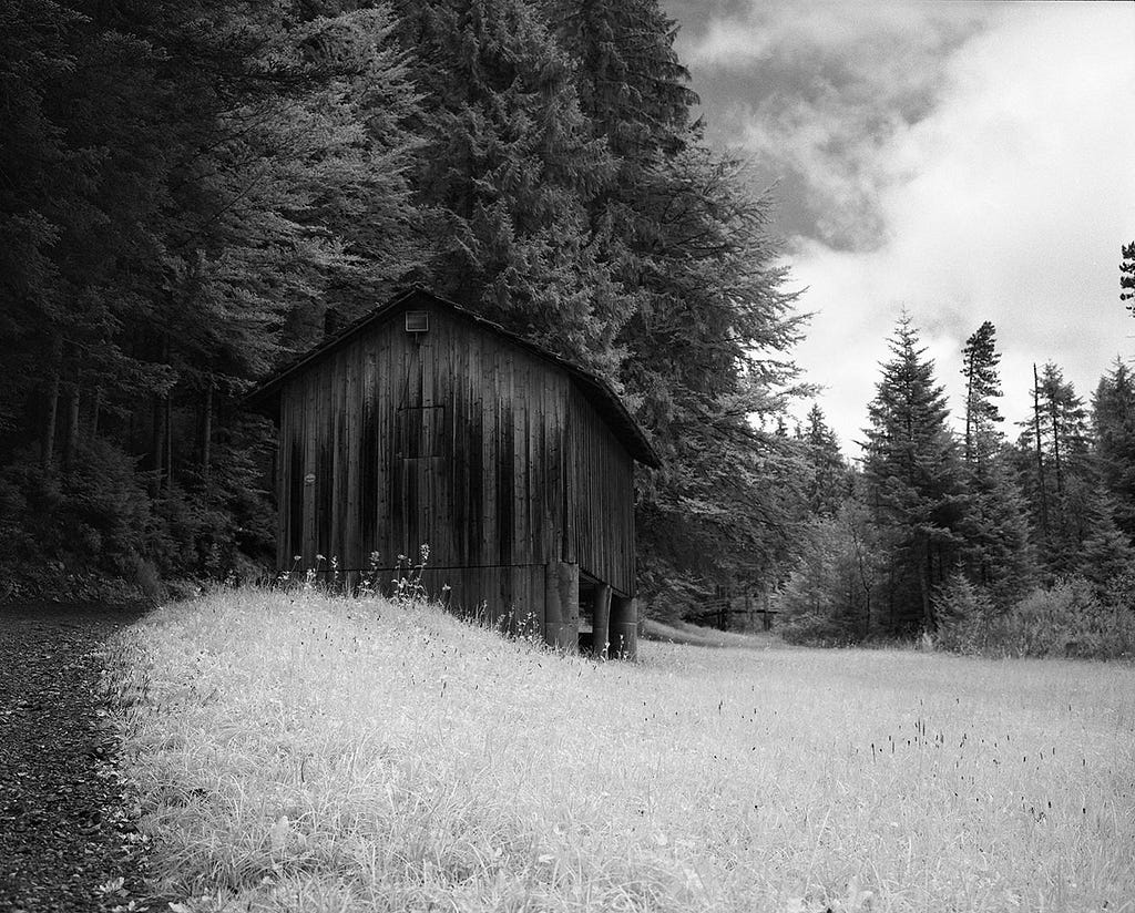
Skies behave in the opposite direction. Blue sky absorbs infrared rather than reflecting it. The result is that a clear blue sky goes nearly black in an infrared image. Clouds, which reflect infrared along with visible light, stay bright. The contrast between a white cloud mass and a near-black sky is something that doesn’t exist in visible-spectrum photography, not that dramatically, not with that weight.
Skin sits somewhere in between. Human skin reflects infrared moderately, which gives portrait and figure work an unusual luminosity, a smoothness to tone and a certain glow to the light on the body, that reads as otherworldly when you’re used to visible-spectrum work. It’s one of the reasons infrared has long been used in portrait and figure photography. The rendering has a particular quality that can’t be arrived at any other way.

Water, stone, and built structures each respond in their own way. Water absorbs infrared and can go quite dark. Stone and concrete reflect it variably, depending on mineral content and surface texture. Architecture photographed in infrared often has a density and weight that doesn’t appear in standard photographs: surfaces that look similar in visible light can have completely different tonal values in infrared.
Two methods, one result
I shoot infrared two ways. On film, primarily medium format and 4x5, using emulsion that responds to near-infrared wavelengths. And digitally, on a Nikon camera that has been converted: the camera’s infrared-blocking filter has been removed and replaced with one that passes only infrared light.
They’re not interchangeable. Film infrared has a grain and tonal quality that comes from the chemistry of the emulsion, particularly in larger formats, where the grain structure is coarser and more visible, and the tonal gradations across a print have a depth that comes from the physics of silver halides responding to light over time. 4x5 and 8x10 film captures significantly more information than any current digital sensor. The resulting prints hold detail and tonal range at large sizes in a way that’s specific to the medium.
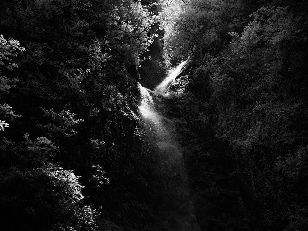
The converted digital camera offers different advantages. Response time, the ability to work in lower light conditions that would be prohibitive for long film exposures, and immediate confirmation of the infrared tonality in a scene before committing film to it. I use both depending on what the situation calls for. Some subjects I’ll shoot on both in the same location.
Neither is a filter applied to a normal photograph. This isn’t a black-and-white conversion with lifted shadows and a pulled sky. The tonality in these images is the result of what the light was doing when the shutter opened.
Why it matters for a print
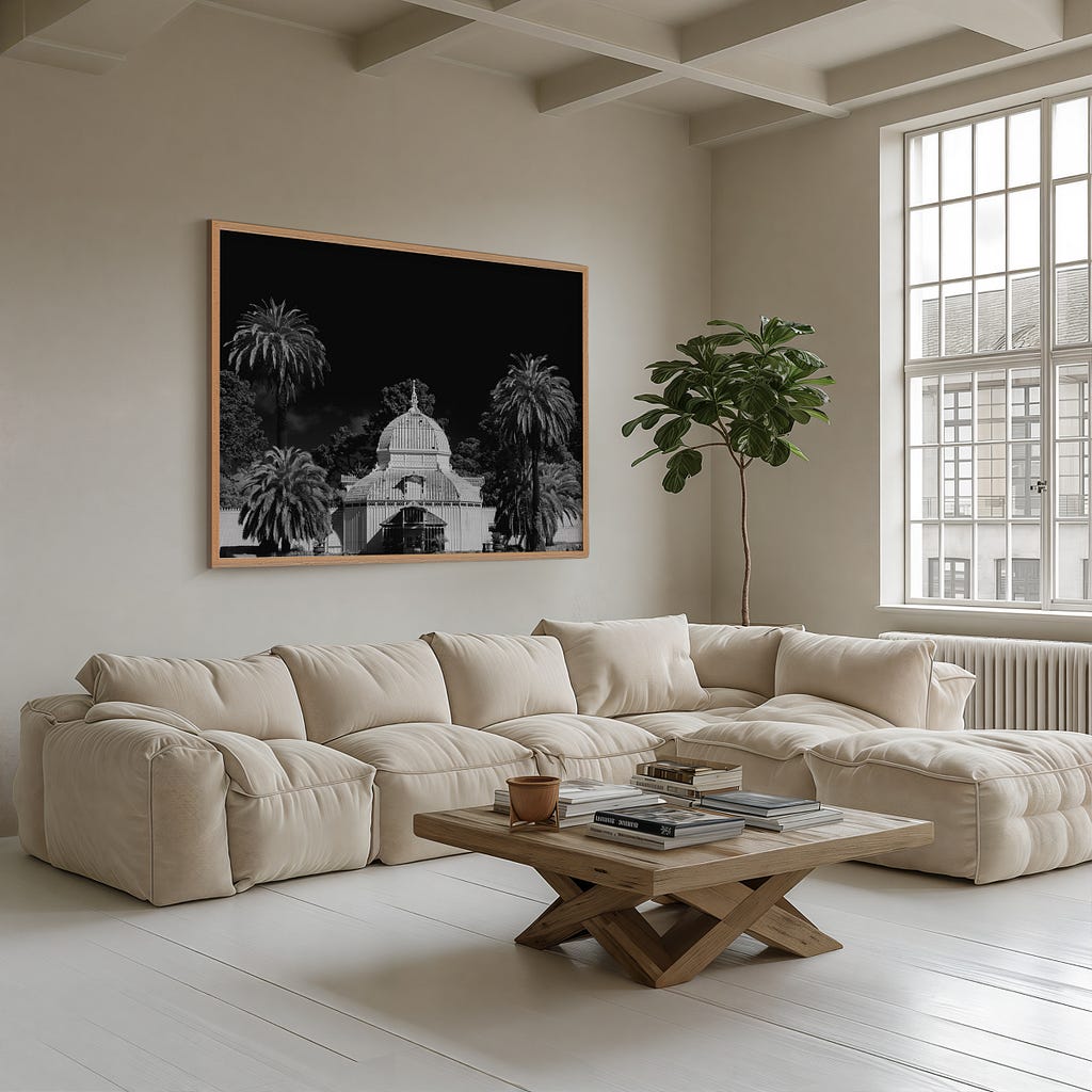
The reason this is worth understanding if you’re considering one of these prints is that the look is not replicable. A digital rendering that mimics the infrared aesthetic (and there are many) will not hold up at the print sizes I work in, and the underlying tonal logic will always be slightly off, because it’s being synthesized rather than captured.
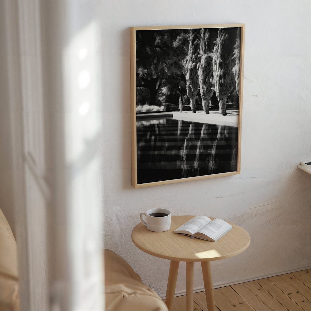
What you’re buying, if you buy one of these prints, is a physical record of light at a frequency you can’t see. The archival print is made from that original capture. The tones are the tones of the world as infrared reads it: grass that knows it’s alive, skies that have real weight, skin that holds light in a different register.
That’s what makes it worth hanging.
Kofi Amoa is a Northern California fine art photographer working in infrared film and digital. Prints from the Scapes, Porcelain, and Supernal series are available by inquiry at kofiamoa.com.